In what ways does
your media product use, develop or challenge forms and conventions of real
media products?
When creating
my magazine, I made sure to make it look professional, it was important to base my work
around real products from
real media conventions. To be able to do this,
I carried out different types of research including general,
specific and detailed. This enabled me to analyse
aspects of front covers, contents pages and double page spreads to get an idea
of popular layouts and
appropriate fonts and ideas for colour schemes. Using real
products from
real media conventions as guidelines enabled
me to adapt my work to make it look as professional
as it could be. The main magazines I focused on when making my product were Q, BILLBOARD and Blender.
FRONT COVER: The main media convention that
I gained most of my ideas from was Q magazine. These ideas include the pose of the model and the colour scheme.
I began with the pose of the
model and
realised that most of the models on Q magazine give a sexy, mysterious look which is what I wanted my
model to give. I then looked at the colour scheme
and decided to use RED, WHITE and
BLACK which seems to be the most appropriate. However, I used
the magazine BILLBOARD as
the media convention to base my layout on. I did this by having Lily
LOVE written over the model and then the writing over the empty space
without having it written over the model.
CONTENTS PAGE: I gained many ideas for my contents page from Q
magazine as this was the most similar type of magazine to mine. I made my
contents page layout
similar to Q by the use of the large red banner and the name of the magazine next to it as used on the
contents page featuring Cheryl Cole. The
way I put together the page numbers and the information is similar to the layout of Q magazine to give it a professional look as shown on the contents page with The Courteeners and Adele.
Also, the pictures I used were similar to the contents page with The Courteeners and I added a review at
the bottom of the page to make it look professional.
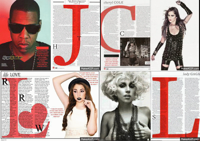
DOUBLE PAGE SPREAD: Similar to my contents page and front cover, I
used Q magazine mostly as a guideline when creating the double page spread. I read through articles in Q magazine and wanted to do something similar.
Also I made the layout of
my double page spread similar to the one in Q by
using the large L behind
the article.
Also for the pose of the model I took inspiration from Q
magazine to give the sexy, mysterious look intended. Lastly, from the Q
double page spreads, I was able to pick out the title of the page which only uses the name of the
model so the reader has to read on to find out what happened. I did all of this
to produce a professional
looking double page spread and so it looks like a real product from real
media conventions.


No comments:
Post a Comment