Looking back at the double page spread I created, I realised
I had to make a few adjustments. I made these my making the quote on the middle
of the page smaller. I did this because I felt it made the page a bit uneven
and created competition between the two quotes and by making it smaller. I also
added a drop shadow to the title and to the large letters used in the article
to make it seem more creative. The last thing I did was that I made it so the
letters were not hanging over the edge on the ‘L’ to make it look neater. I also
made it so it was level at the bottom of the page. I created my double page
like this to match my target audience. I created this double page spread my
using my research as I guidance. I am very pleased with my double page spread as
I feel that it looks professional and creative. In addition, the story I used
for my double page spread I thought may attract my target audience, as they
usually like to read dramatic stories rather than simple ones.
Thursday, 28 February 2013
Tuesday, 26 February 2013
Final Edits for Double Page Spread
Looking back at my double page spread, I noticed there were
a few corrections that needed to be made. One thing that needed to be changed
was the size of the quote. In addition, I noticed that the writing at the top
and the bottom were uneven and hanging over the edge. Also I thought that the
title and the larger letter were quite boring and wanted to change them some
way.
The first thing I did was make the quote in the middle of
the page the same size as the quote in the corner so there does not seem to be
any competition between the two.
I then created a shadow to go behind the title to make it
stand out.
I then did the same to the large letters to make them stand
out more. I did this to make the magazine seem more interesting and creative as
well as it looking professional.
Final Double Page Spread
Proof for First Draft Double Page Spread
The first thing I did to make my double page spread was to
create a boarder around the edge of the page leaving enough room at the bottom
to put a page number.
I then placed the picture of my model on the right said of the
page leaving the other side to have the writing. I made my model big enough and
to cover half my page as that is what my research shows.
I then added an ‘L’ and a heart on the other side of the
page as a background for the writing. I did have it the bright red, which is
used on the rest of the magazine, but, then I realised that it would be too
bright to be able to see the writing over the top so I kept it as the red and
then made it brighter. I decided to have an L and a heart as this article is
about ‘Lily Love’. I decided to have this as the background as my research
shows that their magazine has done the same thing. However, I put a heart with
it to make it my own design.
I then added the title of the article with the name of the
artist I made. I wrote it the way I did as my research shows a similar thing. I
put her first name lower case italics and then her surname in capitals but
regular. I place it where I did as it is easy to notice and easy for the reader
to know whom the article is about.
I then added a page number at the bottom of the page and the
‘V’ next to it to remind the reader what they are reading. I did this as my
research did the same. I then added the date of the magazine issued at the
bottom of the page to remind the reader.
I then wrote my article about my artist that I thought would
be the most interesting to reader. My article is about a young, famous singer
called Lily Love who became a drug addict and an alcoholic after the death of
her brother. This article if about her talking to the magazine and explaining what
happened and what made her get better. It is also about her new single called
‘Forever with Me’ that is dedicated to her brother.
I then looked back at my research and realised they used
quotes from their interview and so I decided to do the same as I had some empty
space. In the top right corner, I used the pen tool the make the text box so it
didn’t go over my model. I did the same for the quote in the middle of the
page. I had the quotes a red as that is the main colour of the magazine. The
reason for why I us3ed the quote I did was because it thought it would draw
more attention and would make the reader want to read the article more as
people like to read dramatic things more.
Double Page Spread First Draft
Friday, 22 February 2013
Hand Drawings for Double Page Spread
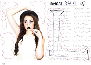
 This is the first
drawing I made for my double page spread. There are a number of problems with
this drawing including all of the empty space, the way the eyes are looking,
which leads off the page, and my research shows a large letter behind the text,
but I want mine to be different so it needs to be changed.
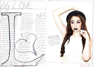
I made some
improvements on this drawing by adding in a heart next to the ‘L’ as the
model’s name is ‘Lily Love’, and I added a quote to fill in the empty space,
however, I still have a problem with the eyes looking the wrong way and there
is still some empty space. In addition, I do not like having the title of the
page saying ‘She’s Back’ as that is what I had on the cover and the contents
page and so I need to refer back to my research. Lastly, I do not like have the
writing in only 2 permeate columns as it looks too spacey.
 The first improvement
I made with this drawing is making the picture of the model on the other side
of the page to make it so the model is facing the writing instead of away. I
then added three columns instead of two as that is what my research shows and it
looks more professional. In addition, I changed the title to ‘lily LOVE’ as that
is what my research shows, however, it seems to look more like a poster so I need
to add a boarder round the edge and I need to add page numbers at the bottom.
This is the final
drawing for my double page spread and this is how I would like it to look. I am
happy with this as it solves all of the problems from before as I filled in the
spaces, changed the title, added my own image in the back and added three columns.
There only thing I need to ensure I do in the process of making my product is the
make it so all of the spacing is equal.

Thursday, 21 February 2013
Photograph for Double Page Spread
The first thing I did to change my photograph was to crop it
into the right shape for my magazine cover.
I then changed the levels of my photograph to make it seem
brighter.
I then changed the hue and saturation to make the photograph look the way I want it to. I continued this until my photograph eventually looked like this…
I then still thought that the picture did not seem right and
thought the background looked too yellow so I used the lasso tool to select the
background and changed the levels of it to look like this….
I then still thought that the picture did not seem right and
thought the background looked too yellow so I used the lasso tool to select the
background and changed the levels of it to look like this….
I then zoomed in closely and realised that there were some
black marks on her face to change this, I had to use the clone tool at the side
to remove it evenly.
I then realised the lipstick on my model seemed to have been
done quite poorly so again I used the cloned tool to colour in the whole lips.
I then realised that the teeth of my model seemed to be
quite dark with a hint of blue in it.
I eventually changed the teeth by making them brighter so
they did not seem grey. I did this by playing with the levels to make them look
better.
I then noticed that my model seemed to look like she had a
bit of arm hair so I decided to use the clone tool to remove some for it to
eventually look smooth and also adds some more light to the arm.
Subscribe to:
Comments (Atom)


