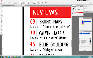
These are all of the problems I noticed about my magazine, I
noticed that the top of the page was too empty and needed to be covered. I realised
that the writing that says ‘THE POWER OF 5 BOYS!’ is the title of the arena
picture and so I should do that for the picture above. I then noticed that the
page numbers on the pictures were placed roughly.
To improve the number placement, I put the page numbers in
the top right corner to make it look more organised.
Then to fill in empty space at the top of the first photograph, I added a title like I did for the picture underneath.
After looking at what I thought was my finished contents
page, I then noticed even more improvements that needed to be made.
I made the title of
each section in capital letters to make it so the spacing in the red box was
more even. I also noticed that on my research that they had full red boxes and
capital letters and so I did the same. In addition, they added a grey box over
one section of the writing and so I decided to do the same.
Looking back at my
research, I realised that they had the title of each page in capitals so I decided
to do the same. In addition, the spacing between the line and the numbers and
the words had to be made bigger.
I then noticed that
the numbers were not in line with the writing and so I had to change that to
make it look more professional.
I then noticed that my
title did not seem right and needed to be changed. I looked back at my research
and noticed that the red banner went all across the page and so I did the same.
However, I wanted to make the magazine my own so instead of having the ‘v’
inside the banner, I had it larger to make it look more artistic.
I then realised that
the mage numbers did not look right and so I looked back to my research and saw
that one of the contents pages had the numbers the way I have to make it
artistic and fun to read instead of plain and simple.
I then thought that
the titles of the pictures did not look right and so I made the spacing around
it more even and removed the line underneath and it made it look over crowded.
FINAL CONTENTS PAGE


No comments:
Post a Comment