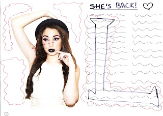
 This is the first
drawing I made for my double page spread. There are a number of problems with
this drawing including all of the empty space, the way the eyes are looking,
which leads off the page, and my research shows a large letter behind the text,
but I want mine to be different so it needs to be changed.
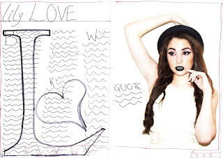
I made some
improvements on this drawing by adding in a heart next to the ‘L’ as the
model’s name is ‘Lily Love’, and I added a quote to fill in the empty space,
however, I still have a problem with the eyes looking the wrong way and there
is still some empty space. In addition, I do not like having the title of the
page saying ‘She’s Back’ as that is what I had on the cover and the contents
page and so I need to refer back to my research. Lastly, I do not like have the
writing in only 2 permeate columns as it looks too spacey.
 The first improvement
I made with this drawing is making the picture of the model on the other side
of the page to make it so the model is facing the writing instead of away. I
then added three columns instead of two as that is what my research shows and it
looks more professional. In addition, I changed the title to ‘lily LOVE’ as that
is what my research shows, however, it seems to look more like a poster so I need
to add a boarder round the edge and I need to add page numbers at the bottom.
This is the final
drawing for my double page spread and this is how I would like it to look. I am
happy with this as it solves all of the problems from before as I filled in the
spaces, changed the title, added my own image in the back and added three columns.
There only thing I need to ensure I do in the process of making my product is the
make it so all of the spacing is equal.


No comments:
Post a Comment