In some ways I feel that this is a good double page spread for a music
magazine as it has a clear picture of who the artist is which automatically
shows the reader what the piece of writing is about without them having to read
and then find out. Also the title is big and clear which intrigues the reader
of who it is about and has ’50 CENT’ written in a different colour so is draws
the attention straight to it so the reader can confirm that the picture of the
artist is who they think it is. In addition, they have used big letters for the
first letter of the paragraph, which adds a creative aspect to the magazine and
makes it seem more interesting.
However,
I feel that the colour of the background behind the artist should be white like
the rest of the page because you can easily see that the picture takes up over
half the page. Also this double page spread looks a bit like a poster so to
improve they could of added a boarder round it.
Out of
the three, this double page spread is my favourite as it has a clear picture of
the artist on one side and plenty of writing on the other side. The large ‘J’
in the middle of the page relates to the artist which gives an artistic look and
that side of the page will not look boring. The title at the top is clear.
There is a good colour scheme as there are not too many colours and so it does
not look overcrowded. ‘RapRadar’ shows the reader that Jay-Z is a rapper. All
of this shows briefly what the article is about without having to read it
fully.
However,
I feel that the big ‘J’ in the middle of the page should be a lighter colour
and not red because it makes it harder to read as the ‘J’ stands out too much.
I also feel that there is too much writing as there is a whole page worth as
well as the writing on the picture.
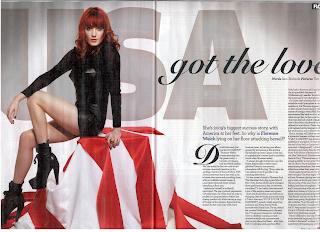
Personally,
I feel that this double page spread is better than the previous one as it seems
to look better and so the audience are more likely to read this one. This is
because the layout seems to be more artistic and interesting with the ‘USA’
written at the back in large letters, which shows the reader what the piece of
writing is about without having to read it. Also Florence Welch is the main
picture with her sitting on what looks like part of the American flag and
therefore gave the reader a better idea that the writing is about Florence
going to America or that she has something to do with America. In addition, the
writing ‘Florence Welch’ is in a different colour which is nowhere else on the
page and so it automatically draws the attention to those words.
However,
the way the writing has been made looks confusing as the writing again looks
too blocked and therefore it looks uneven and messy. Also, as well as the
double page spread previously, is looks more like a poster as there is no
boarder around the pages.


No comments:
Post a Comment